Hi, my name's David Nguyen, but you can call me Dave.
I design websites, digital products and brand identities to help businesses reach their potential and serve their customers.
I've been a design professional since 2001. I'm based in Melbourne.
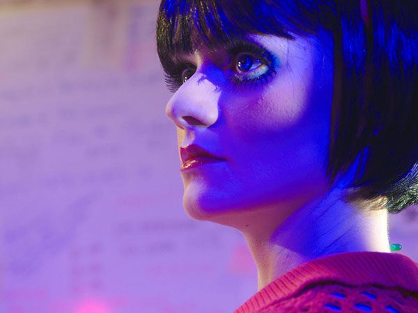
(I also made a series of short films and music videos.)